Trends
An interior design straight from Milan. How to translate global trends into your home design?
I think there is nothing left to be written about Salone del Mobile in Milan, Italy. However, true connoisseurs of indoor design are never bored with the subject. They can go on for hours about exceptionally surprising combinations, fresh and smart colours, high-quality materials, natural stone, precious metals, or utmost attention to detail.
Milan is the Italian capital of design, where the smallest knob or reading lamp is a small piece of art. Nowhere else do exhibitors attach so much importance and give so much attention to their solutions and furniture. Each edition of Salone del Mobile includes the latest in technology and consumer electronics, where the showcased systems of concealed kitchen ranges or household appliances that pop out from otherwise flat worktops are always a good show. To exhibit at Salone del Mobile is a mandatory item on the agenda of anyone who wants to stay up to date with the trends, including architects, designers and engineers. 430 thousand visitors at this year’s edition speak to the priority of the event. Imagine the whole population of Gdańsk moving for six days to Milan! Salone del Mobile is one of the biggest interior design events in the world, and a forum for amateurs, professionals, creators and designers. Brimming with inspirations and superior design, each edition of Salone del Mobile leaves an indelible impression on the way we think and design for months or years.
Milan is a trendsetter. What’s new in the indoor design department?
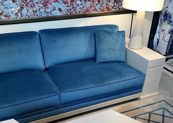
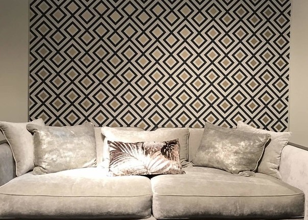
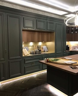
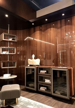
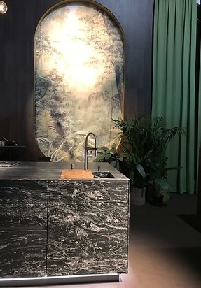
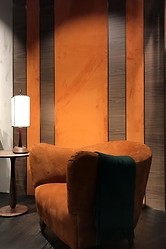
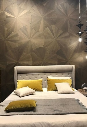
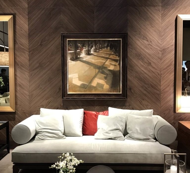
The first thing evident during this year’s Salone del Mobile was textiles. Textiles ruled the event. Soft, velvet and cosy materials on furniture, floors, walls and ceilings; more often than not with cool-to-the-touch stone or exotic wood species. The wood alone, shown in dark and almost rustic embodiments, was an undisputed surprise and a fresh trend which countered the extremely popular oak and ash woods. Most design concepts showcased in Milan clearly featured dark, moody and extremely refined themes. The bold and saturated colours on the walls provided an excellent canvas to expose the new and interesting, including powder rose, orange, sage green and tones of navy blue. The most surprising features at Salone del Mobile were the bathroom designs. Here, colours were not only showcased with tiles, but first and foremost by a departure from the standard white of whiteware and tapware. There was an increasing number of brands which offered washbasins, bathtubs, bowls and tapware in powdery pastels or with striking finish details in graphite. A veritable ‘cherry topping’ was the gleam and timeless elegance of gold and copper. Precious metals were enchantingly exposed like jewellery, the gloss and glow of which further refined the very smart indoor designs.
The wind of inspiration from Western Europe is already here in Poland. The market-probing combinations of colours and the overall ambiance of the indoor designs showcased in Milan are now the features of what Polish designers and manufacturers offer. This is very good news; it means that the Polish market is well aware of tasteful design and is becoming increasingly bold in making decisions which break the framework of the ordinary. Scandinavian trends are now slowly waning with colours, natural materials and stone in the foreground. Bold combinations of soft textiles with cold stone dominate every coverage from this year’s Salone del Mobile. Polish manufacturers are not being left behind, but are responding to the changing trends in design. An open approach to customers, increasingly bolder architectural designs and the ambition to stay ahead of the game, are providing the local market with materials not unlike the latest features in Milan.
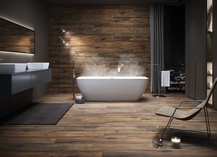
Wood and emerald: beauty and relaxation in your bathroom
Combinations of wood with deep shades of green are a tested and proven trend which always looks good. The trend is inspired by pure nature and the colours of healthy forests which teem with life. This colour palette promotes calm and relaxes the occupants with a very smart and refined appearance. If you want to translate the trend into your interior design, go for a bold and strong colour with wooden accents. Where natural wood is not good due to its properties, wood-textured gres tiles can be used, a wide selection of which is featured in the Grand Wood collection, for example. Fifteen colour options with a large tile format and a true reproduction of the texture of wood provide great potential for many indoor designs. The tiles are great for lining your shower cubicle walls and floor to make the bathroom resemble a home spa. The tones of natural wood are a perfect background for emerald accents, wallpapers or paint. If the room is small, the deep colours can be made lighter with light-coloured plain tiles, like those in the Flower Cemento White and Dreaming Beige collections. Add well adjusted and mood-enhancing lights. Now you can relax like you are in a bathroom of a luxurious Italian villa.
Marble, the king of stone. The luxury you can afford
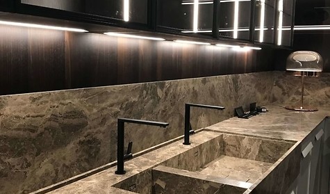
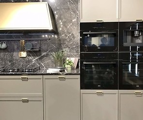
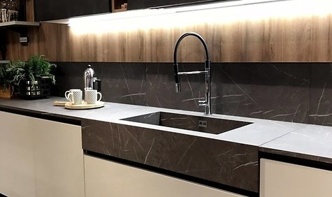
Those who love natural stone should be satisfied with the great number of stylish and budget-friendly indoor design solutions. The Carrara Pulpis collection features a true representation of one of the most expensive stones: marble. The light and warm white colour tones with subtle veining look very luxurious and refined. In bathrooms, this style goes well with accessories, accents, tapware and furniture pieces in black. Add lamps with frosted shades and gilded trim to get a Milanese recipe for a great interior. This pattern looks great in the kitchen: as the background for wall cubicles, a scratch- and heat-resistant rangehood or an uncommon idea for kitchen range front panels. If you have a fireplace, you can achieve the look of a uniform material for your mantelpiece and the floor lining in front of the hearth.
Dark and refined. Go with a strong interior accent
Those who love natural stone should be satisfied with the great number of stylish and budget-friendly indoor design solutions. The Carrara Pulpis collection features a true representation of one of the most expensive stones: marble. The light and warm white colour tones with subtle veining look very luxurious and refined. In bathrooms, this style goes well with accessories, accents, tapware and furniture pieces in black. Add lamps with frosted shades and gilded trim to get a Milanese recipe for a great interior. This pattern looks great in the kitchen: as the background for wall cubicles, a scratch- and heat-resistant rangehood or an uncommon idea for kitchen range front panels. If you have a fireplace, you can achieve the look of a uniform material for your mantelpiece and the floor lining in front of the hearth.

